Popups are the #1 tool to generate leads and grow subscribers. That’s a fact, so 60% of e-commerce brands are using them.
Because who wouldn’t want to generate leads non-stop?
But there are a lot of annoying popups out there. They come from businesses whose marketing strategies are as bad as a New England’s freezing winter.
If you use popups right, they can generate 4,000+ monthly leads and make lead generation four times cheaper .
But what is the right way to use popups?
Here’s how to create high converting popups campaign to grow your audience and drive sales:
Personalize popups with the right targeting
A sale promotion popup on the homepage. A popup with a newsletter subscription on a blog. A season discount on the product page. Configure popups to be displayed to visitors on specific pages, and you’ll make them relevant. No reason to bombard anyone with the same message.
Run A/B tests to see the best tactics
If you’d like to try different tactics for engaging website visitors (texts, promotions, discount sizes, etc.), you can easily do so. Just create popup campaigns, test them, learn what worked, and implement the best strategies. And repeat the whole process from time to time!
Prepare beautiful designs that fit your website.
Be creative when making popups! You can customize any element as you need to make them look natural on your website. Online businesses, for example, add cool images and compelling texts to grab attention and make visitors click—all without being annoying.
Turn on cart abandonment campaigns.
Yes, popups are smart enough to detect that a visitor left products in the shopping cart. Why not use them to send a quick and friendly reminder?
Make special popups for people who converted
If a visitor has already converted, you can prepare special campaigns for them based on UTM parameters. Example: utm_medium=newsletter indicates visitors from a specific newsletter who read specific content. Exclude them from the lead gen campaign, and prepare something relevant.
Make it easy to close popups.
This way, visitors can keep exploring your website without being interrupted by a popup they can’t close.
Follow these tips and…
Your popup campaigns will be relevant and add value for visitors.
Want to see such a campaign, by the way?
Here you go:
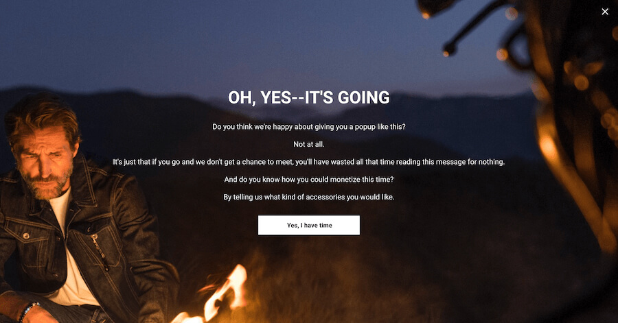
This high-performing popup campaign example from Asphalte has it all.

In fact, this popup generated those 4,000+ monthly leads I mentioned in the beginning. Here’s why this popup performs so well:
Unique design
This popup is anything but boring! The great design makes it look natural on the brand’s website and appeals to the target audience
Engaging copy
The campaign has an interesting and engaging copy, which is way different from texts people usually see on annoying and pushy popups
Full-page view
This format helps grab the attention of visitors, but it’s also easy to close up. And… It’s displayed only once to visitors
Tested and proven
The brand used A/B testing to define the best-working features (image, text, website page)
A thing of beauty, indeed. You could do it, too, you know.
Stay healthy,
Pawel Lawrowski
Head of Growth at Wisepops
